When walking into a kitchen, the eye is naturally drawn to the largest horizontal surface: the countertop. While many homeowners spend weeks agonizing over cabinet hardware or flooring samples, the countertop color is actually the element that ties the entire room together. It acts as the visual anchor that bridges the gap between your cabinetry and your backsplash.
In 2026, choosing the perfect color is no longer just about following a fleeting trend. It is a strategic design decision that affects the perceived size of your kitchen, the way light moves through the space, and the long term resale value of your property. Whether you are aiming for a high contrast modern look or a seamless, monochromatic sanctuary, the color you choose will define the kitchen’s personality for decades.
Key Takeaways
- The Contrast Rule: Balance light cabinets with darker surfaces and dark cabinets with lighter tones to create visual depth.
- Lighting Impact: Natural and artificial light change how a color looks; always view samples in your kitchen’s specific lighting.
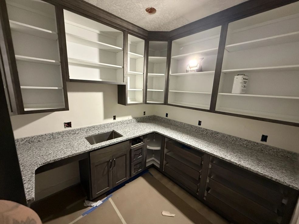
- Material Dynamics: Quartz offers predictable, uniform colors, while natural stones like granite provide one of a kind, organic movement.
- The “Rule of Three”: Limit your primary kitchen palette to three main colors to avoid a cluttered or overwhelming aesthetic.
- Maintenance Awareness: Extremely dark or extremely light solid colors show more debris; veined or speckled patterns are better at hiding daily use.
- Long Term Value: Neutral palettes (whites, greys, and beiges) remain the safest bet for high ROI and buyer appeal.
- Precision Execution: Color only looks as good as the fit. Digital templating ensures your chosen color flows perfectly across seams.
What Is the Significance of Countertop Color?
The countertop color is the “connective tissue” of kitchen design. It occupies a central physical and visual space, meaning it has the power to either make a small kitchen feel expansive or a large kitchen feel intimate. Beyond aesthetics, color choice also impacts the psychology of the home whites and light greys promote a sense of cleanliness and calm, while deep blacks and charcoals evoke a sense of sophisticated luxury and “moody” elegance.
Why Is Understanding Color Coordination Important?
Without a clear plan for color coordination, a kitchen can quickly feel disjointed. If the countertop color competes with the flooring or clashes with the cabinet undertones (mixing “warm” and “cool” incorrectly), the room will feel “off” even if the materials are expensive. Understanding how to balance these elements ensures that your renovation looks professionally designed rather than pieced together.
How Do Different Color Categories Compare?
| Color Category | Best For | Pros | Cons |
| Pure White/Cream | Small Kitchens | Makes space feel huge and bright | Shows every crumb and spill |
| Cool Greys | Modern/Industrial | Highly versatile; hides dust well | Can feel “cold” without wood accents |
| Deep Black/Charcoal | Luxury/High Contrast | Creates a stunning, bold focal point | Shows water spots and fingerprints |
| Earth Tones/Browns | Traditional/Rustic | Adds warmth and a “homely” feel | Can look dated if not paired correctly |
| Veined/Patterned | High Traffic Homes | Masks wear and tear beautifully | Difficult to match at the seams |
Phases of Choosing Your Perfect Countertop Color
1. Evaluate Your Cabinetry First
Your cabinets are the “background” for your countertops. If you have white or light oak cabinets, a dark grey or black countertop creates a crisp, contemporary contrast. If you have dark espresso or navy cabinets, a white quartz with subtle veining will “pop” and prevent the kitchen from feeling like a cave.
2. Analyze the Lighting Environment
Lighting is the most overlooked factor in color selection. A dark granite slab that looks beautiful in a sun drenched showroom might look like a black hole in a kitchen with limited windows.
- North Facing Rooms: Usually have cooler, bluish light; warm toned countertops help balance this.
- South Facing Rooms: Get plenty of warm sun; cooler greys and whites look crisp here.
3. Select Your Material and Pattern
Color isn’t just a flat hue; it’s also about the “movement” of the stone.
- Consistent Patterns (Quartz): Perfect for modern, minimalist designs where you want a clean, predictable look.
- Dramatic Movement (Quartzite/Marble): Acts as a piece of “natural art.” If your countertop has a lot of movement, keep your backsplash simple so they don’t compete.
4. Digital Templating and Grain Matching
Once the color is chosen, the layout is critical. If you choose a stone with heavy veining, our digital laser templating allows us to “grain match” the seams. This ensures that the pattern flows naturally from one slab to the next, making the color look intentional and high end rather than interrupted.
5. Final Finish Selection
The “color” is also affected by the finish. A Polished finish makes colors look more vibrant and saturated. A Honed (matte) finish softens the color and gives it a more contemporary, velvety appearance.
What Factors Affect How Color Ages?
- UV Exposure: Some materials can fade if exposed to direct sunlight for several hours a day. Quartz is highly stable, but some natural stones may shift slightly over decades.
- Trend Longevity: While “forest green” or “terracotta” might be popular this year, neutral tones like “Carrara” style quartz have remained popular for over a century.
- Cleaning Chemicals: Using harsh cleaners on natural stone can “dull” the color over time by stripping the sealer.
How Can You Ensure a Cohesive Look?
- Sample Testing: Never buy a slab based on a photo. Bring a sample home and place it against your cabinets at different times of the day.
- The Backsplash Bridge: Use your backsplash to pull colors from both the cabinet and the countertop. If your countertop is white with grey veins, a grey tile backsplash creates a perfect visual bridge.
- Hardware Accents: Match your faucet and cabinet pulls to the “temperature” of your countertop. Warm gold hardware looks stunning with creamy, beige veined stone, while matte black or chrome suits cool grey and white stones.
What Tools Help You Choose Your Color?
- Mood Boards: Physical or digital boards (like Pinterest) help you see how textures and colors interact.
- 3D Renderings: Many designers use software to show you exactly how your chosen color will look in a digital version of your actual kitchen.
- Slab Viewing: Visit the Salt Stone gallery to see the full sized slabs. The “movement” in a 10 foot slab looks much different than a 4 inch sample.
What Should You Do Next?
- Bring Your Samples: When you visit us, bring a cabinet door and a flooring sample.
- Take Photos of Your Space: Show us your current lighting and layout.
- Think About Your Lifestyle: If you have young children, consider a patterned quartz that is more “forgiving” of messes.
Conclusion
Selecting the right countertop color is a journey that balances personal style with the practical realities of your home’s architecture. The right choice doesn’t just make your kitchen look better it makes it feel better. It creates a space where you want to spend time, whether you are cooking a Tuesday night dinner or hosting a holiday gathering.
At Salt Stone Fabrication & Design, we understand that color is only half the battle. A beautiful color must be backed by a beautiful fit. By utilizing digital laser templating and advanced CNC machinery, we ensure that your chosen color is showcased perfectly, with precise edges and seamless transitions. Our craftsmen take pride in turning a raw slab into a refined feature of your home.
Your dream kitchen starts with the perfect palette.